Tuesday, November 18, 2008

The New Gig


I haven't had a chance to post in quite some time, as I have been rather busy with my new job at Texas State University. On top of getting back into the trenches overseeing various sports for the department, I have also been given the keys to the creative department.

The images above reflect some examples of graphics, shirts and web banners I have designed since here.

Friday, July 18, 2008

Tid Bits


I wanted to create some conceptual work for my portfolio, so I came up with these three ads for businesses back home; Memorial Medical Center (a local hospital), La Posta(one of the most popular restaurants back home) and the El Paso Symphony Summer Keyboard Series(a mythical concert series that is held in the summer to help promote their new Arts district.)

Monday, July 7, 2008

TidBits


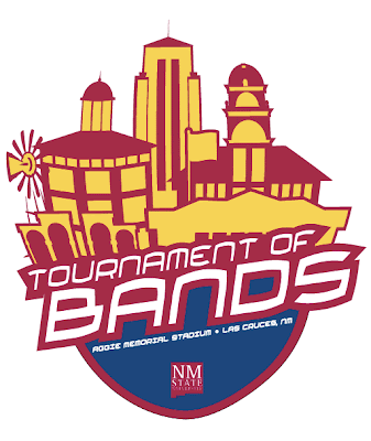
I was going through some old files the other day when I came across some slides I had done for a marching band competition I had made for my old university last year that were used on the stadium's video board.

I remember the band director telling me they didn't really have a logo, so they gave me free reign as to what to get up on the board.

In the style of Drum Corp International (the NFL of Marching Pageantry [dci.org] ), and considering the target market(12-18 yeard olds and the occasionally obsessed band parent.), I came up with this design.

Here are a few notes i sent to the band director:

I thought of this shield logo, to kind of serve as an all-purpose brand for the event. Not only could it be used for all media materials, but for apparel and merchandise as well. I thought a neat idea from a recruiting standpoint, would be to highlight different landmarks on campus: a windmill from the Ag College, Skeen Hall, The Old Campus Gates, Memorial Tower, Goddard Hall, and of course, the flagpole from Pride Field.

Instead of plain Crimson and White, I utilized some of the color palette from the university branding scheme to make it all really pop. Finally, I used the official university logo.

Good ol' Big Papa

NEW:


ORIGINAL:


I finally got around to taking my logo designs to the owner of Big Papa's last week, and he gave me some constructive feedback as to what he did and didn't like. He wanted the look to be a little more 'Polynesian' and was worried that the original character I used, might be perceived by some of his regulars as too 'self-glorifying.'

He really liked the detail-work in the tribal aspects of the design, so I extended that concept in the little Maori warrior. I used a different font in the verbiage to give it more of an organic look--something the owner was looking for.

Let's see if he likes the revisions.

Tuesday, July 1, 2008

Maid Service Logos


Here is some logo development I did for a local maid service.

Their clientele consists is based in some of the most affluent neighborhoods in San Antonio.

They asked for a logo that reflected an elegant and established personality using shades of pink and black.

Wednesday, June 25, 2008

Favors can be fun


8.5 x 11 Cover of Brochure for Aggie Winnder's Circle Registration Mailer

Last Friday, I received an e-mail from a friend back at New Mexico State needing some serious help on putting together a pamphlet that was going to be sent out to boosters for a 2008 football campaign.

He was given a large amount of content and told to make it look "exclusive". I set the document up in In-Design as a four page 8.5x11 spread. I was able to fit all of the content on three pages, but I needed something for the cover.

Thinking the Boosters might appreciate some type of commemorative collateral piece, I designed this layout with NM State standouts Chase Holbrook( No.12) and Chris Williams(No. 28).

Monday, June 23, 2008

Bases loaded--top of the ninth.


17" x 22" Team Poster NMSU Athletics
I was coming up with a big "goose egg" when it came to trying to deliver a design for this project.

Enter Wade Gubbels--first year marketing intern. We hammered this out in about an hour just bouncing ideas back and forth at each other just shy of the deadline.

It's all about the family!


We were really trying to crack into a new audience by appealing to families. A new ticket price system was helping, but we needed something that was going to get the attention of the target market.

With a little help from one of the Mouse-House's big current-hits, we saw a surge in attendance up to 1,500 as the Aggies faced defending-conference champion Boise State.

Men's Basketball is here!


I was going for simplistic on this as a foil from the visual overload you normally get from a team poster. I wanted it to be all about the players and coach.

The white back drop was especially hard, in that we couldnt find one anywhere in town big enough.

In this great image by Rebecca Craig, your looking at about six, 9-foot table clothes taped to the wall and floor of the PanAm Annex lobby.

Women's Ball


Here is a mock up for a billboard we used to advertise ticket sales for NM State's women's basketball program. Off to their best start in 10 years, the Aggies went into conference play with only 3 losses and the first victory over in-state rival New Mexico in over 10 years.

Photo by Rebecca Craig.

Aggie Men's Basketball Season Tickets


Photo by Rebecca Craig.

Covered in Crimson


We used this graphic on NMStateSports.com and Facebook.com to spread the word for the Crimson Campaign against UTEP.

Here's to another year of Aggie Domination


How about them nationally-ranked Aggies? Photo by Rebecca Craig.

More Aggie Football


This year the Aggies had a legitimate chance at having not only a winning season, but going undefeated at home for the first time since 2002. We came up with this concept, but it never went to print.

What to expect in 2007...


A conceptual piece for New Mexico State Football. Photo by Rebecca Craig.

Mr Big Shot

The university's switch-a-rooney with the mascot attracted some attention from the Chronicle of Higher Education.

This appeared in their February 2nd, 2007 Issue:

New Mexico State University

Mascot: Pistol Pete

What's happening: After a five-year break, the mascot is packing heat
again.

The details: Apparently the 10-day waiting period is up for the Aggies'
rough-and-tumble mascot, Pistol Pete. After the terrorist attacks of
2001, the trigger-happy mascot laid down his guns. When the university
redesigned him in 2005, the now-clean-cut cowpoke wielded a lasso
instead of his characteristic smoke wagons. In an area famous for its
gunslingers (Billy the Kid was sentenced to death in nearby Mesilla),
the decision didn't sit well with students.

"It almost seemed like they didn't realize what sort of an emotional
connection there was for students, the alumni, and the community with
the old mascot," says Aaron M. Villalobos, a student at the time who is
now a university spokesman.

The new mascot is a product of discussions with marketers as well as
local rodeo riders about authentic cowboy wear. The new Pistol Pete is
a student in costume, sans foam head, and most importantly, well armed.


How exciting! My first job, and I've already been quoted in the Chronicle for Higher Education as a "University Spokesman!"

Fixing the Pistol Pete debacle of 2005

In the Fall of 2006, I took a great job with the New Mexico State Athletic Department.

One of the first things I asked to tackle was what I called the, "further development" of the doomed school mascot.  A redesign in 2005 left the market less than happy with the  "Lasso Larry" mark that replaced the shared "cowboy" logo from Oklahoma State.

The re-design of the physical mascot's costume (pictured between the old and new marks), was extremely popular with students alumni and the community. Working with New Mexico graphic artist Richard Evarts of Artesia, we collaborated to transition the lasso mark to a pistol mark.

I felt it was important that the overall integrity of the mark stayed intact(we left the original wordmark in place).  After all, we wanted some consistency in the brand which had been working for a few years already. I didn't want to have to start from scratch.

The final product was the result of about 15 re-designs, consisting of 10-12 different representations of the mark each time(Poor Richard worked his tail off.) 

The new logo was debuted on some thermal mugs at the Men's Basketball home Opener against Pacific. People were thrilled to see the Pistol back in Pete and a new star was (re)born!

While I was at it, I got the green light to develop our logo and brand portfolio a little more. I'd have to say the biggest contribution was the "Aggie Country" mark.  I was trying to think of a way to represent not only a physical place, but the state of mind and special place in every "Ag's" heart. I wanted a mark that would be on signs in people's front yards--"Welcome to Aggie Country," and in the form of rear windshield graphics on the army of suped-up pick-ups camping out in the Ag School parking lots.

It racked my brains for a few days, but finally I decided the mark should somehow include the majestic Organ Mountains  which many an Aggie grow to love(and miss), even years after they are out of Las Cruces.

The rest was as easy as laying some text over it.  We have a winner!

Finally, I wanted to create something that utilizing the essence of New Mexico.  The debacle had turned a lot of people off to the athletic/mascot mark and merchandise was not selling very well.

What single part of New Mexico culture could we use to represent the institution while appealing to a variety of markets?

California has the bear. Texas has the Star. As for New Mexico? They have the Zia.

As a test run, I had a local seamstress create a 5x7-foot New Mexico flag fielding the school's colors instead of the states traditional royal red and gold. We threw that puppy in the student section at the football game against the University of New Mexico and they couldn't get enough.

I used the crimson sun symbol and gave the rays a liquid look.  Making sure it had some legs outside of the local market, I used the standard"Aggie" font to splash "New Mexico State" across the front to identify the brand.

NM State Homecoming 2006

Straight out of college, I was approached by the New Mexico State University Alumni Association about developing the official logo for their 2006 Homecoming festivities.

Partnering up with the X Prize, an international space flight competition held in the LAs Cruces area annually, 2006's celebration would highlight southern New Mexico's contributions to the space race.

Interim director Nicole Shoup's request was two-fold: 

1) Create a primary text logo that would be easy to reproduce in a wide variety of mediums.

-and- 

2) Use that logo in conjunction with a vivid image for collateral materials  and collectible merchandise.

The primary focus of the print is the transparent "X"(X Prize) logo faded over a multi-color gradient that parallels  the area's signature sunsets. 

Anchoring the image, and serving as a solid canvas for the event logo, is a blacked-out layer grouping of the Organ Mountains east of campus, and Goddard Hall--seat of NMSU's Engineering Department and one of the campus'  signature facilities.