Friday, July 18, 2008

Tid Bits


I wanted to create some conceptual work for my portfolio, so I came up with these three ads for businesses back home; Memorial Medical Center (a local hospital), La Posta(one of the most popular restaurants back home) and the El Paso Symphony Summer Keyboard Series(a mythical concert series that is held in the summer to help promote their new Arts district.)

Monday, July 7, 2008

TidBits


I was going through some old files the other day when I came across some slides I had done for a marching band competition I had made for my old university last year that were used on the stadium's video board.

I remember the band director telling me they didn't really have a logo, so they gave me free reign as to what to get up on the board.

In the style of Drum Corp International (the NFL of Marching Pageantry [dci.org] ), and considering the target market(12-18 yeard olds and the occasionally obsessed band parent.), I came up with this design.

Here are a few notes i sent to the band director:

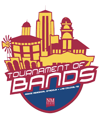
I thought of this shield logo, to kind of serve as an all-purpose brand for the event. Not only could it be used for all media materials, but for apparel and merchandise as well. I thought a neat idea from a recruiting standpoint, would be to highlight different landmarks on campus: a windmill from the Ag College, Skeen Hall, The Old Campus Gates, Memorial Tower, Goddard Hall, and of course, the flagpole from Pride Field.

Instead of plain Crimson and White, I utilized some of the color palette from the university branding scheme to make it all really pop. Finally, I used the official university logo.

Good ol' Big Papa

NEW:


ORIGINAL:


I finally got around to taking my logo designs to the owner of Big Papa's last week, and he gave me some constructive feedback as to what he did and didn't like. He wanted the look to be a little more 'Polynesian' and was worried that the original character I used, might be perceived by some of his regulars as too 'self-glorifying.'

He really liked the detail-work in the tribal aspects of the design, so I extended that concept in the little Maori warrior. I used a different font in the verbiage to give it more of an organic look--something the owner was looking for.

Let's see if he likes the revisions.

Tuesday, July 1, 2008

Maid Service Logos


Here is some logo development I did for a local maid service.

Their clientele consists is based in some of the most affluent neighborhoods in San Antonio.

They asked for a logo that reflected an elegant and established personality using shades of pink and black.